SHAREDEMOS
Building a Sales Enablement Platform from Scratch

Project Information
Product: ShareDemos
Date: November 2014 - August 2020
Team Size: 15-20
My Roles: Product Designer (2014) Senior Product Designer (2016) Head of Product Design (2018)
Key Takeaways
ShareDemos emerged to fill a gap in real-time, dynamic sales enablement tools.
Challenged the traditional content distribution methods, moving beyond basic PDFs and PPTs.
Emphasized the importance of effective taxonomy in organizing content.
Developed 'the player' – a versatile page for various content types, focusing on user engagement and interactivity.
Adopted best practices from various digital platforms for an optimal user experience.
Ensured the design was adaptable, interactive, and engaging, suitable for diverse content and screen sizes.
ShareDemos' success is marked by its adaptability to user needs and its popularity among Fortune 500 companies.
The platform is celebrated for making sales enablement efficient and user-friendly.

The Old Grind: PDFs, PPTs, and Yawns
Remember 2014? Iggy Azalea regrettably topped the charts, we were all doing the whip and nae nae, and the Seattle Seahawks snagged their first Super Bowl win. But in the world of sales enablement? Not so much of a party. Amidst the bucket challenges, viral dances, and sports triumphs, a glaring gap in the market became evident while I tinkered away on VMware's Knowledge Portal App. Companies were trapped in a time warp, needing a real-time, dynamic content creation and distribution platform. It was like watching a black-and-white TV in the age of 4K streaming - clearly, a revolution was overdue, and we set out to start one.
Imagine tech companies armed only with PowerPoints and PDFs in a valiant yet futile effort to capture their audience's attention. The routine was downright Kafkaesque: create, email, get feedback, revise, and repeat. Tech companies handcrafting their marketing assets and then pushing them out via emails and forums. It was like sending a message in a bottle. Need a tiny change? Back it goes to the digital agency, only to return in a new email days later, getting as much attention as a Terms and Conditions page. The impact? Practically invisible. It was a cycle crying out for a makeover.
But 'what if there was a better way?' - a more efficient way to create and distribute content while measuring user engagement immediately.

Rethinking the Game: Users, Content, and Those Pesky Taxonomies
Diving into the unknown, we faced a maze of UX puzzles.
How do users interact with content?
What makes a taxonomy more than just a fancy word for a category?
Our war room, littered with sticky notes and coffee cups, became a battleground for ideas. We dissected every aspect of content interaction, unearthing a crucial insight: good taxonomy might be invisible, but its absence is blindingly obvious. Imagine trying to find your favorite book in a library without any labels. It got me thinking: is organizing content as crucial as creating it?
Spoiler: Yes.

ShareDemos Office. 2015.
The Big Revelation: Content is King, Structure is... Well, Not So Much
Amid the race against time and VMware's looming deadline, we faced our first eureka moment. Structures are the shifting sands, but content is the bedrock.
To define our user value system, we needed more data. I decided to conduct introspective talks with VMware's product marketing teams to help anticipate user needs more accurately. This decision ultimately led us out of a long rabbit hole and helped shape today's product.
Through conversations with our customers, I discovered that large enterprise companies have more significant communication challenges because their product teams are frequently compartmentalized and rarely communicate with one another, let alone collaborate on knowledge materials.
At this point, it was evident that product teams rarely agree on structure, but the majority will have their content readily available. In the case of VMware, most of their material was already produced and kept in a separate content repository. The material was unchanged even though their suggested taxonomies kept evolving throughout our product catch-up calls.
Using taxonomies or navigation categories to help your end-users discover content is quite helpful. However, forcing an organization-first authoring experience for admins might result in a significant friction point, given the volatility of categorization among product teams. And getting material out of those long site map trees would become a nightmare.
The solution? Let authors create first and organize later. It's like throwing a potluck dinner- let everyone bring their best dishes first, then worry about the seating arrangement.

Taxonomy authoring experience.
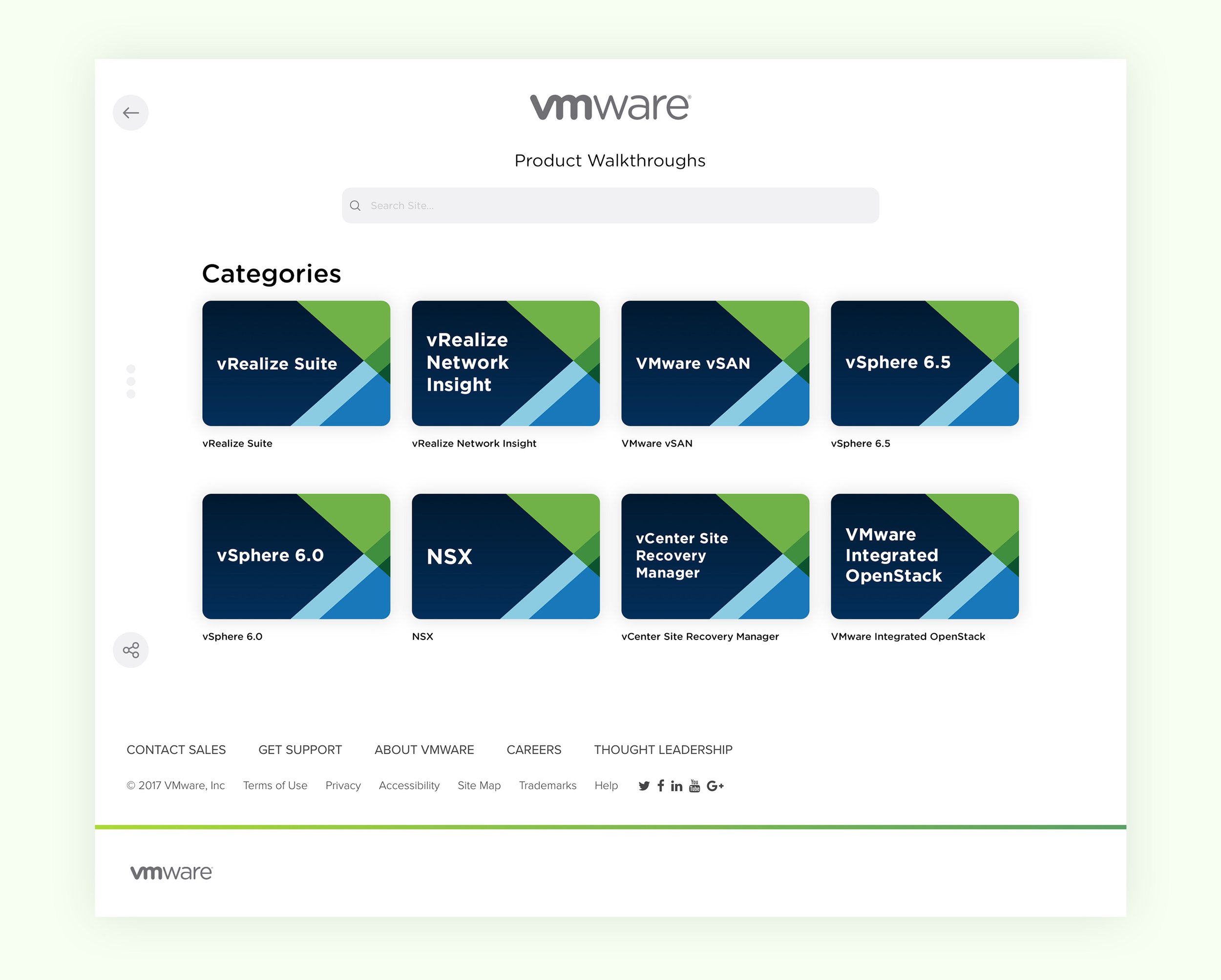
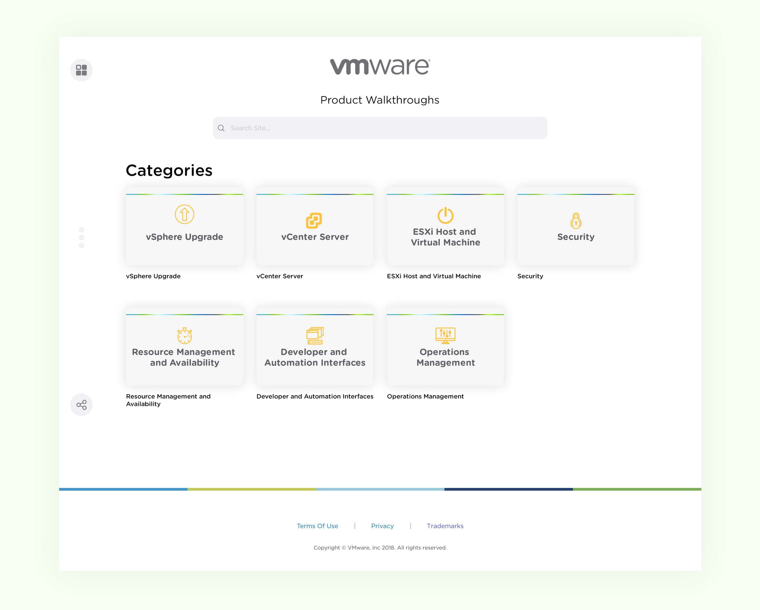
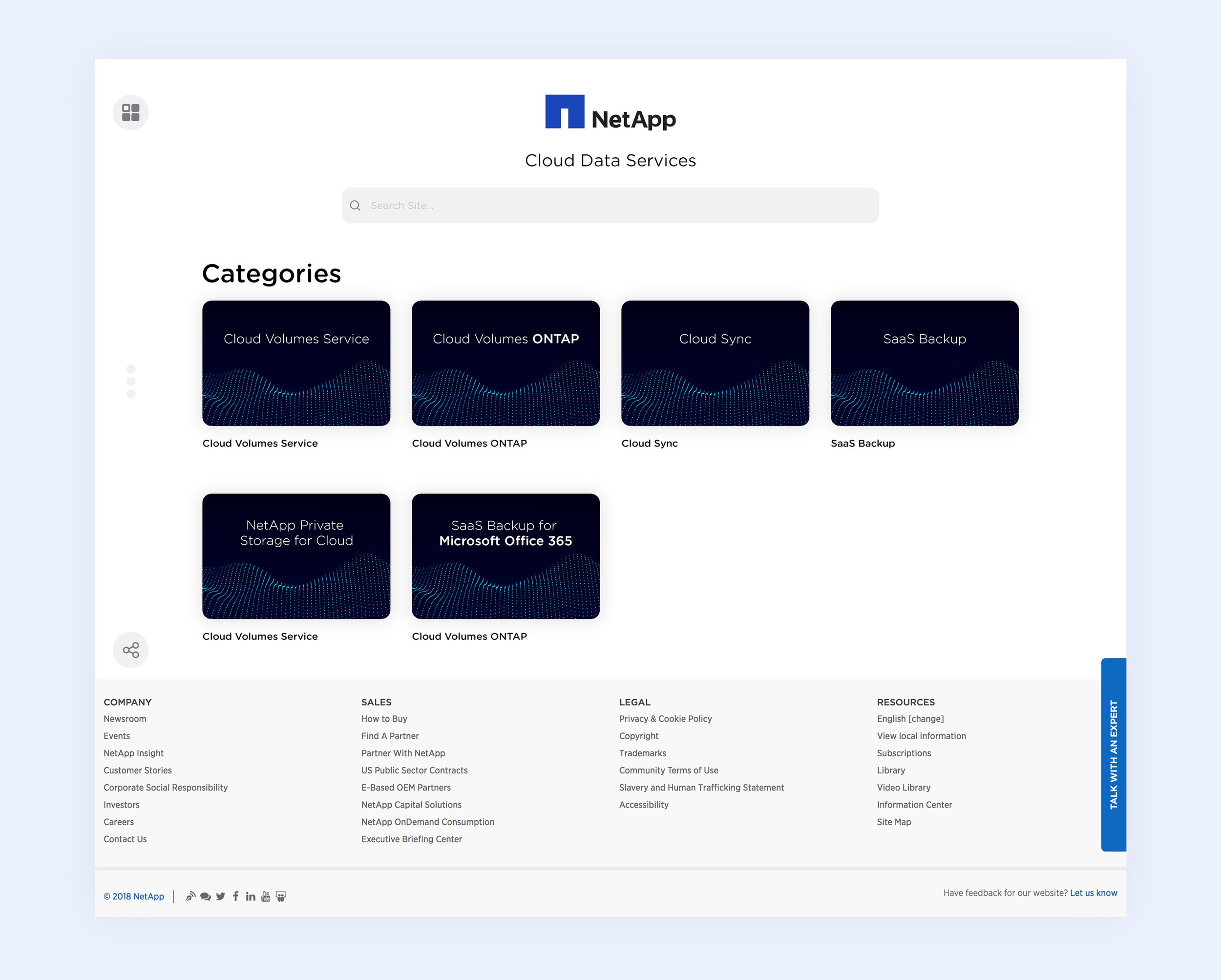
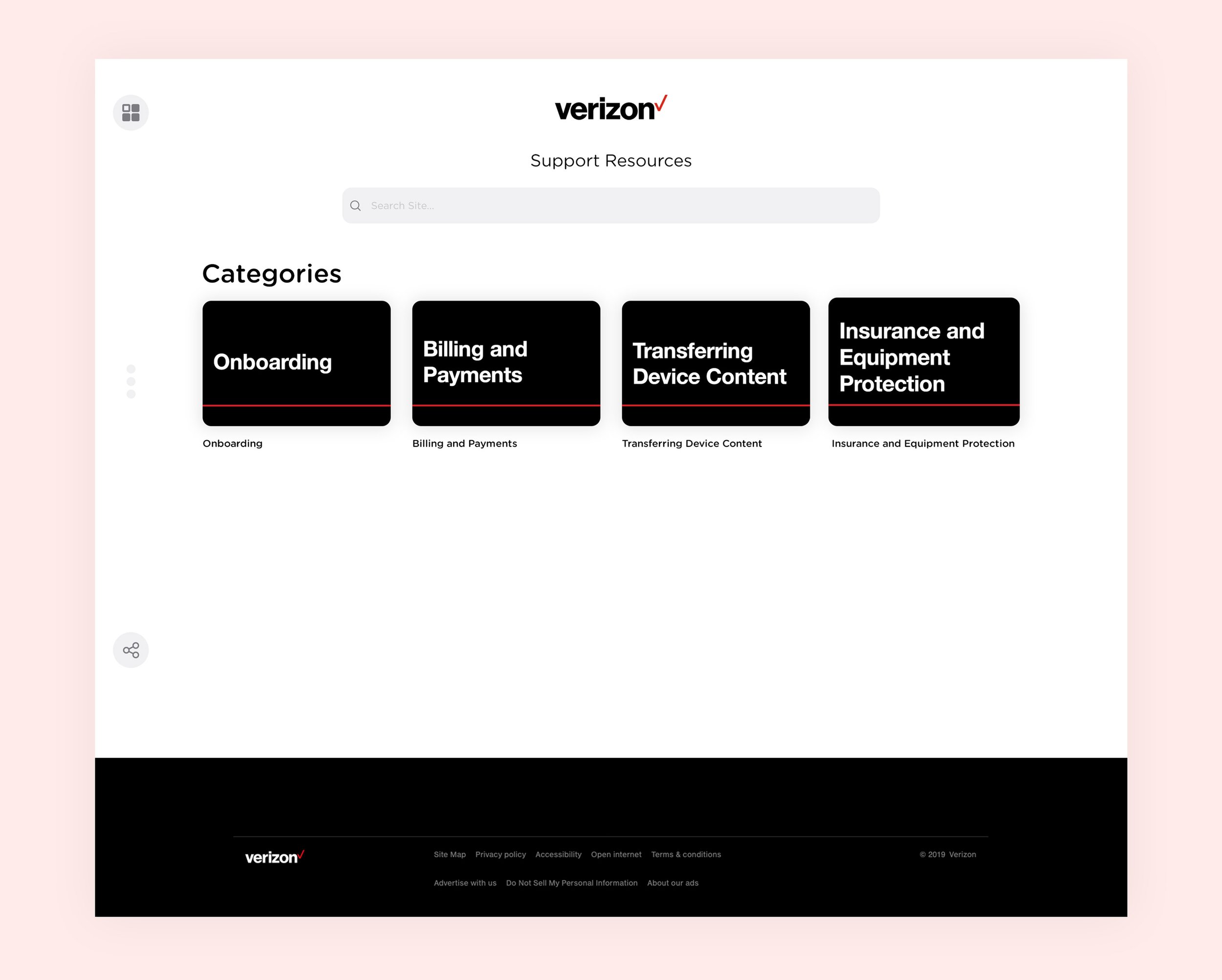
Sales Enablement Content Comes in All Shapes and Sizes
Great job; now you have your driving philosophy figured out. Content is at the front and center for these companies.
How do you make it spectacular to consume?
'The player,' as we referred to it, was the immersive page where the end-user interacted with the company assets. If this was genuinely going to be a robust, self-sustaining platform, we couldn't restrict the admins to any file types. From my past conversations with marketing teams across companies, I learned that most of their material would be in PDFs, in-app authored documents, pictures, video, and audio. Whether a text-heavy PDF or a vibrant video, each content type needed its moment to shine. Embarking on this mission, I knew the player page needed to be more than just a screen; it had to be a chameleon, seamlessly adapting to whatever content it displayed. I ventured into the digital world, drawing inspiration from platforms that excelled in content presentation. Think Microsoft PowerPoint, SlideShare, Issuu, Instagram, and YouTube. While none were the perfect blueprint, they were goldmines of user patterns and design practices.
I always remind my junior designers that the best user experiences are like the air we breathe - essential but unnoticed. They're woven into the fabric of our everyday lives unnoticed because they fit so seamlessly.
Crafting the Player Page
My vision was a page where every asset, regardless of format, holds center stage with the grandeur it deserves. Here's what the recipe for the ultimate player page included:
Showcase Central: Each asset, be it a PDF, video, or audio clip, must be front and center, claiming as much screen real estate as possible.
Fluid Design: The content had to adapt to various screen sizes fluidly, ensuring it always looked its best.
Interactive Toolkit: Depending on the content type, users need tools at their fingertips - notes, highlighting capabilities, and more.
Engagement Arsenal: Engagement is key, so features like commenting and sharing are essential. We needed to present content and spark conversations and interactions around it, turning passive viewers into active participants.
With these guidelines in mind, I began constructing our player page. My challenge was transforming how users interacted with content, making every encounter with the player page an experience. The answer to this challenge was a digital ecosystem where content didn't just exist - it lived, breathed, and engaged the audience.

‘The Player Page’. 2017
If I had to summarize the crucial features that defined ShareDemos' success, I would say that our platform's two most essential abilities were:
Allow admins to seamlessly author and categorize diverse content.
Present end-users with an intuitive content repository experience.
As we expanded to other customers, we learned more about our users and their workflows, which varied depending on their roles. Eventually, we developed features that addressed the new diversity of workflows for both managers and end-users alike. Not every company, of course, agreed with our fit in their journeys; thus, we had to remain agile and provide custom features as services. Some of these custom-built features became so popular that we eventually rolled them out to all users across our platform. By the end of 2019, our lineup of features, both custom and native, consisted of the following;
Authoring
Full reporting page with custom analytic widgets based on role
Team management and role assignment
A Complete digital asset manager for easy file linking across the site
Content integrations with Box, Dropbox, SalesForce, and Google Drive
A suite of connected apps such as Pathfinder, Quizzes, Flashcards, and Journeys
Custom brand compliance code injection for header and footers
Content highlighting with bulletin board
Group management for private instances for internal use
End-User
Global asset search
Apps hub
Site wide Internationalization and translations
Bookmarking and favoriting
Consumption tracking reports
Recommended content
Authors and End-Users, Piecing It All Together
Validating My Design Choices
As the product gained traction among companies looking to evolve their sales enablement cycles, ShareDemos began to find its market fit. But just how exactly do you measure product market fit? When recurring compliments aren't enough, and the number of daily active users can't tell you the complete story, how can you validate that your design choices have ultimately made the product better for its users? A fascinating article by Rahul Vohra, the founder, and CEO of Superhuman, attempts to define market fit by the work of Sean Ellis. I recommend giving it a read.
But perhaps market fit is best summarized directly by Sean Ellis, a growth hacker in the early days of Dropbox, LogMeIn, and Eventbrite. In the article The Startup Pyramid, Sean shares his formula for product market fit.
"I ask existing users of a product how they would feel if they could no longer use the product. In my experience, achieving product/market fit requires at least 40% of users saying they would be "very disappointed" without your product."
I, too, was curious to know if my design approach for the product was indeed making a difference in these organizations. And it wasn't long before our surveys reached back to me and painted a picture of a new sales enablement application living harmoniously and rooted deeply across various fortune 500 companies.
While I can't publicly share the specific survey findings with you, our market fit was best illustrated by the plethora of companies we were able to help transform. I am truly proud of what we've built at ShareDemos. I've been a part of the product team at ShareDemos from its early days, working on design and user experience. It's been a long journey, and there have been plenty of highs and lows, but it feels great to see the product take off and help so many sales teams transform their enablement process. Our mission was to make sales enablement easy and efficient for everyone involved. And it seems we hit the mark; customers are happy with what we've built.
If you are part of a design team struggling with your product design process or are just starting out, I hope you find some inspiration in our story. How is your product achieving market fit and better serving its users? Reach out to me on any of my social channels and let me know.


DESIGN ADVICE #7
Test early and often. What works in theory might fail in practice.
-

Changing the Sales Game With AI
-

Bridging Environmental Awareness with Design